Sub Space - Subscription Tracker Case Study
Overview
This project was conducted based on a design challenge from Springboard in order to simulate the process of completing a design project in a real world scenario. A basic framework was given to me about an existing company and web application that would need a mobile app created. It was up to me to define the company's brand and design a mobile application that would meet their users' needs.
Duration
1 Month - August 2021
Tools
Figma, Invision Freehand, Miro, Google Docs
My Role
Secondary Research
User Interviews
Screen Flows
Wireframing
Visual Design
Interaction Design
Background
The following company information, business goals and user information was provided to me as a jumping off point for this project.
Company Context
It’s hard to keep track of all the products and services that we subscribe to each month. All we see is money deducted from our accounts for services that we might not even need or want anymore. A company has a product that keeps track of all of your subscription fees on websites, apps, services, etc. over the years.
This company has only launched a desktop-only website that is not mobile-friendly and now needs to create a mobile version of its product that can be used by a broader audience. Right now the company only benefits from desktop users but they know that adding a mobile-friendly version of their product will significantly increase their market reach (with more than half of potential users on mobile devices). This will ultimately result in more users and more business.
Business Goals
Create the following user stories for an iOS or Android mobile app to support the existing website:
As a current user, I want to see all of my subscriptions in one place so that I can get a comprehensive view of my spending on subscriptions
As a returning user, I want to unsubscribe from a subscription so that I can reduce needless spending
As a consumer, I want to be notified if any of my subscriptions are about to be auto-renewed so that I can make a decision about if I want to renew the subscription and continue spending money
User Information
The majority of their users are over the age of 30
Their user base is an equal split between men and women
While the product is currently used in the US, the company will be expanding to the German market (to significantly increase its user base)
They use phone and desktop equally
Middle class
Trying to be more budget-conscious
Discovery
Research & Competitive Analysis
In order to better understand the market I completed research and competitive analysis across multiple applications.
Objective
Determine how competitors are handling the following user stories
As a current user, I want to see all of my subscriptions in one place so that I can get a comprehensive view of my spending on subscriptions
As a returning user, I want to unsubscribe from a subscription so that I can reduce needless spending
As a consumer, I want to be notified if any of my subscriptions are about to be auto-renewed so that I can make a decision about if I want to renew the subscription and continue spending money
Research Questions
How do other applications handle displaying users subscriptions in a mobile app/site?
How do other applications allow users to unsubscribe from their subscriptions?
How do other applications alert users when their subscription is about to be auto renewed?
How are other applications handling translations to another language?
Design
User Flows
Creating user flows helped me to get the page structure organized and make decisions on the flow of the app
Wireframes
After completing my user flows I wanted to get some basic wireframes done quickly. I decided to use Invision Freehand to quickly sketch out each page. This would allow me to validate my ideas prior to creating high fidelity designs in Figma.
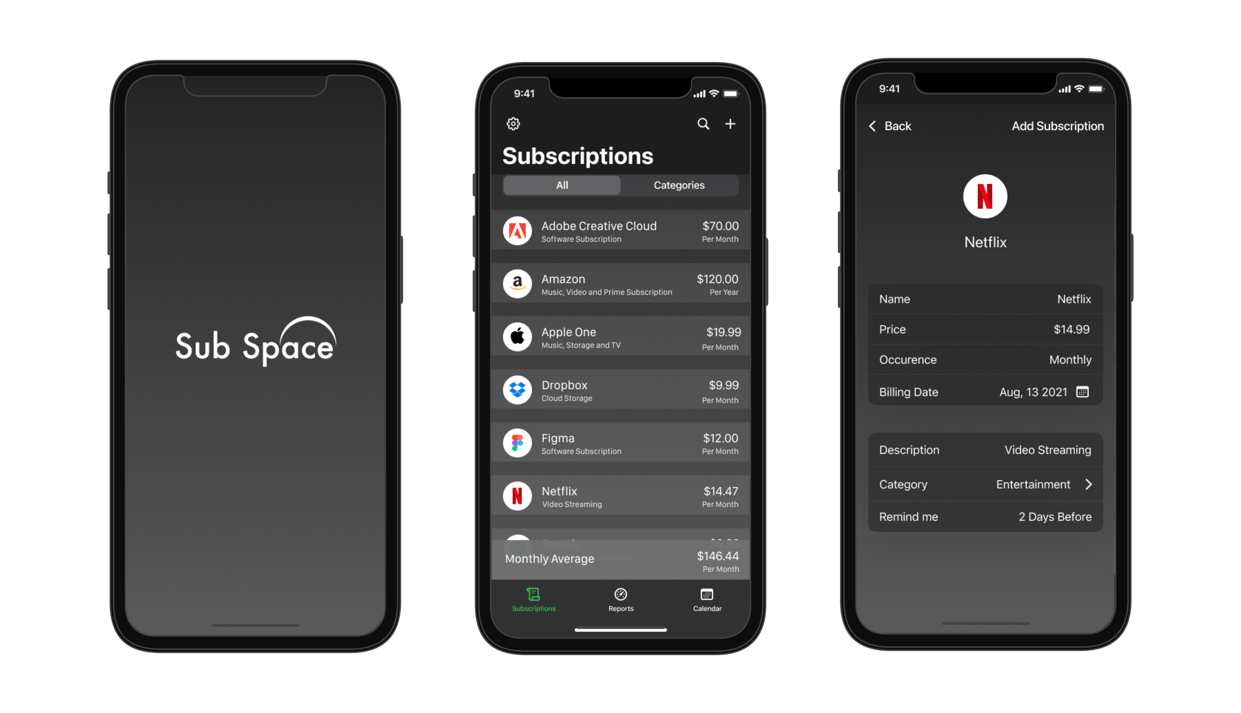
High Fidelity
Once my wireframes were complete and validated I used the feedback my users gave to spin up some high fidelity designs. My goal with these designs was to create a fun space-like atmosphere that did not take away from the business objectives of showcasing the users subscriptions.
Validate
Wireframes
In order to validate my wireframes I performed 3 moderated usability tests with participants between the ages of 30 - 50. During these tests I wanted to discover general usability issues with the flows of my wireframes including - adding a subscription, creating categories, adjusting the language, canceling a subscription and viewing expenses. Participants were given specific tasks to help them navigate through these pages accordingly. The objective of this test was to answer 2 main questions - Is each workflow intuitive to the user? Can the user accomplish each task quickly and confidently?
My results found a few major usability problems:
No way to add a subscription that isn’t part of the provided list (custom subscription)
Finding a category was difficult for most users. The icon wasn’t clear
There were multiple buttons for the same action across the wireframe. This was confusing for most users
Each of these usability issues were resolved as part of the high fidelity designs.
High Fidelity
For my high fidelity designs I conducted usability tests with participants between the ages of 35 - 65. I wanted to continue to uncover general usability issues with the flows of my designs including - adding a subscription, creating categories, adjusting the language, canceling a subscription and viewing expenses. Each participant was given specific tasks to help them navigate through each flow. The objective of this test was to continue to flush out - Is each workflow intuitive to the user? Can the user accomplish each task quickly and confidently?
My results found one major usability problem, which was that users did not feel comfortable linking their subscription account (Netflix) to Sub Space as they felt like it wasn’t secure. This prompted me to change the flow of the application to redirect users to a page hosted by the subscription provider, rather than having them enter their username and password for their subscription inside of Sub Space.
Final Thoughts
Creating Sub Space was a great learning experience as it allowed me to further experiment with my visual design capabilities and grow my UI and UX skills. It also helped me grow as a researcher by closely comparing multiple applications that were all very similar. I did find it challenging to create something unique during this project. This helped me learn that sometimes when something has already been done well we don’t need to reinvent the wheel in order to solve the users problem.