Slope - An eCommerce App Case Study
Overview
Slope is an eCommerce app created during my UX/UI Bootcamp at Springboard. It is designed to help skiers find the right pair of skis for them to purchase. There is a lot of technical jargon to sort through when purchasing skis and doing the research on your own is quite overwhelming. I’m interested in helping these individuals streamline their choices and help them find the gear that best fits their needs.
My Role
User Research, User Interviews, Sketching, Wireframing, Screen Flows, Branding, Visual Design, Interaction Design
Duration
April - June 2021
Tools
Figma, Fig Jam, Miro, Google Docs, Google Forms
Empathize
Surveys and Secondary Research
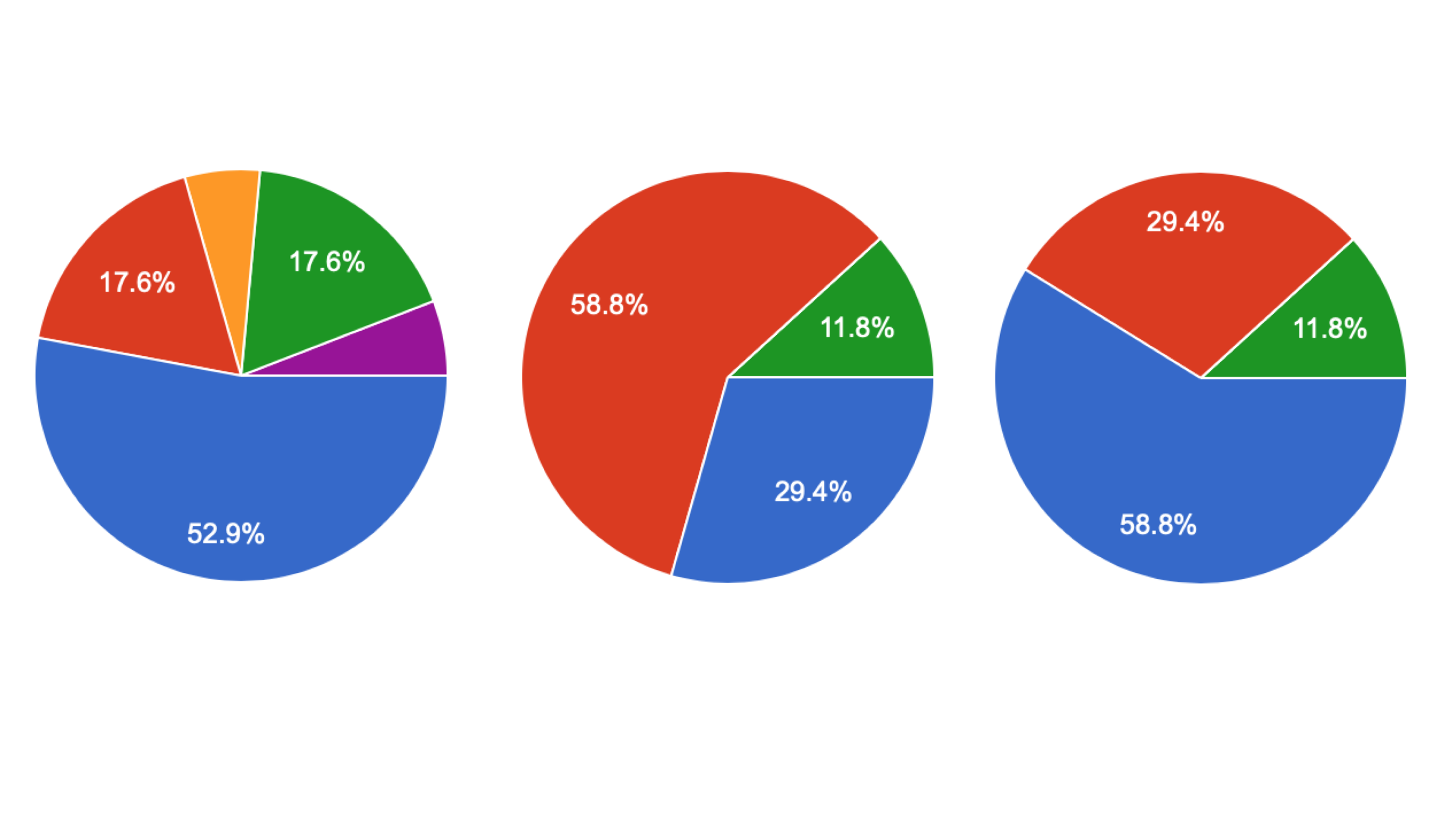
I found the best place to start to better understand this problem was with quantitative research. I started by sending out a survey over social media. The results were clear. Most participants found the ski buying experience confusing and that they needed help buying skis. They also preferred to purchase skis from a local shop as well as spend time researching their equipment.
User Interviews
After conducting this survey I completed 5 user interviews to further understand why users found the buying experience confusing. During my user interviews I learned that most users found the buying process to be confusing because the equipment is always changing. New technology and innovations in the industry have changed the buying experience dramatically.
“There’s so much choice in the market today and it’s confusing unless you’re constantly keeping up with the latest technology and reading reviews. It’s hard to find what you’re looking for unless you have someone at a shop helping you.”
— Chuck
“I relied heavily on the owner at [my local ski shop] to help me pick out the skis that were right me”
— Melody
“A customized online buying experience would help make up for the lack of professional service that exists today”
— Andrew
Define
Synthesize
Synthesizing my research provided more insight into the problem areas. It became clear that users found the technology and jaron used to describe features on skis was the main source of confusion. There was also a lack of trust. Customers felt like online retailers just wanted to sell them the most expensive product and didn’t care about what was the right fit for them.
Affinity Maps
Synthesizing my research through affinity maps allowed me to learn that there is confusion around technology and that the online buying experience is lacking that of local shops with great customer service.
Personas
Creating Personas helped to focus on who the users of my app were and ideate on designs to fit their needs. It also helped me to focus in on what was most important to my users.
User Flows
User flows provided me with the structure I needed to move forward with ideation. I outlined the red routes and determined which flows were most important.
Problem Statements and User Stories
How might we educate buyers of skiing equipment on the latest technology?
As a skier who is looking to purchase skis I want to be able to find out what pair of skis are the right fit for me so I can make an informed purchasing decision
How might we provide a trusted source for purchasing skiing equipment?
As a skier who is looking to purchase skis online I want to buy my skis from a site that has the expertise of a local ski shop in order for me to feel comfortable that I'm getting the right equipment.
Ideate
Sketches
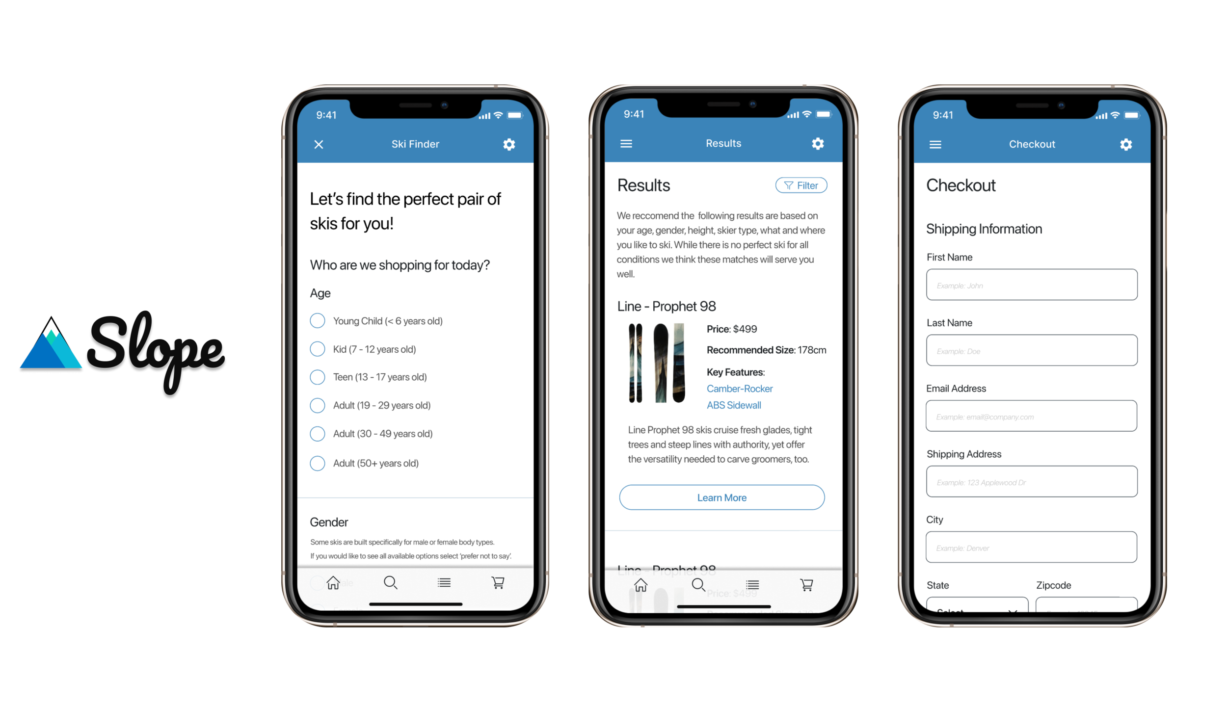
After sketching some ideas I created a ski finder tool to help guide users through the buying process. The tool asks users a variety of questions in order to match them with skis that fit their needs. This tool became the foundation of the buying experience for the site. As part of the ideation process I learned a lot about how some interactions are better than others. I also found out first hand the challenges that come along with designing for mobile devices.
I modeled the ecommerce flow from other well known sites, combining components that worked well but also highlighted the product. This was so users could have a consistent and familiar experience without the need to learn something new.
Prototype
Wireframes
As I moved further into the prototyping process it became clear that I needed to take a ‘less is more’ approach when designing for mobile. I simplified the ski finder tool and highlighted only the important questions that needed to be asked. The checkout flow ended up staying pretty similar to the original sketches as it’s a familiar experience to users.
High Fidelity Designs
These high fidelity designs represent multiple iterations of testing and prototyping. They showcase strong visuals and clear flows to help the user find what they need.
Prototype: https://www.figma.com/proto/x2C0MLLJaTzaTsjMdMJdfF/21.2-High-Fidelity-Mockups?page-id=0%3A1&node-id=261%3A92&viewport=241%2C48%2C0.24&scaling=scale-down&starting-point-node-id=164%3A417
Test
Usability Testing - Wireframes
Once I completed the wireframes I did some usability testing to highlight any issues. I found that users were a little confused on what to do if they didn’t know the answer to the question. They wanted more information on the options available to them. This was a difficult problem because each question was important to the process. I decided to address the lack of clarity by adding in sections that could help users easily find relevant information when it wasn’t clear. I also decided that the UI components needed to be more clear in order to prevent confusion.
With these recommendations in place it was time once again to increase the fidelity of these designs in order to test something a little more polished.
Usability Testing - High Fidelity
I took my high fidelity designs through 2 rounds of usability testing and solved some important problems.
Gender on web forms: In order to match users with the right equipment a skier's gender was an important question. Ski companies build skis that are specifically designed for men and women. I wanted to make sure we were being inclusive while approaching this question so I went through a few iterations on the best way to approach this. After some useful feedback I decided to include a ‘prefer not to say’ response that would showcase all skis, regardless of gender, to the user. I now feel that we are asking this in an inclusive way.
I also learned that providing an expected experience on the checkout process is key. Users want to have a clear path to getting answers to questions and checking out quickly.
Final Thoughts
It’s best to take a minimalist approach when designing for mobile. It’s easy to add elements to a page that don’t need to be there. I was reminded through this project to always keep focus on the user and only add what they need, no more.
Design thinking is not linear. It’s a never ending process that helps designers build the right thing. Designs are never done. They can always be improved upon, however we must remember that there may be other problems that we need to move on to that are more pressing.
As the solo designer on this project, I quickly learned not to design in a box. It’s always important to get help from others to help drive the designs forward. Iteration is key and constructive feedback helps us all move forward together.
